Game Designer

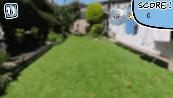
DON'T POP!
Role: Designer, Programmer, Artist, Animator
Team Size: 2
Engine: Unity
Platforms: PC (Itch.io)
Development time: 1 Month


Don't Pop! is an arcade bullet hell where you play as a bubble avoiding being popped by rocket powered fingers! Inspired by early flash games, Don't Pop! is designed to be played in browsers, and can be found on itch.io.
Don't Pop! was a solo unity project where I did all the game design, programming, character art and animations. I collaborated with artist Kieran Stephen (https://www.artstation.com/k_stephen) on the UI art and design. Kieran provided all the UI art such as main menu buttons, font and game icons.
Don't Pop! was a project developed in a month. With the early prototype taking 2 days, I spent time expanding the idea while keeping my programming skills in mind regarding scope. When I finished Don't Pop! I had seriously improved my programming skills.
Contributions to the project
%20(300%20x%20400%20px).png)
%20(300%20x%20400%20px).png)
%20(300%20x%20400%20px).png)
%20(300%20x%20400%20px).png)
%20(300%20x%20400%20px).png)
%20(300%20x%20400%20px).png)
%20(300%20x%20400%20px).png)
-
Lead the design of all game mechanics and levels in collaboration with another designer with input from the whole team.
-
Created detailed design documentation
-
Used C# to add game feel to prototype game mechanics to improve their clarity.
-
Balanced numerous variables in engine, such as player speed or bullet pattern count, to provide the most fun and balanced experience.
-
Guided the direction of Art and Audio departments to enhance the game design of the project.
-
Balanced difficulty between normal and hard modes for 2 levels.
-
UI layout design with prototype functionality.
-
Aided the organisation of playtest sessions.
-
Key communicator between all specialisms (programming, art and audio).
-
Assisted in bug fixing numerous features of the project
Project Overview
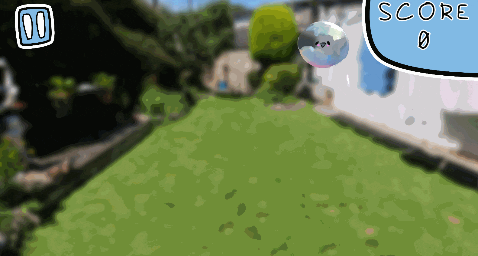
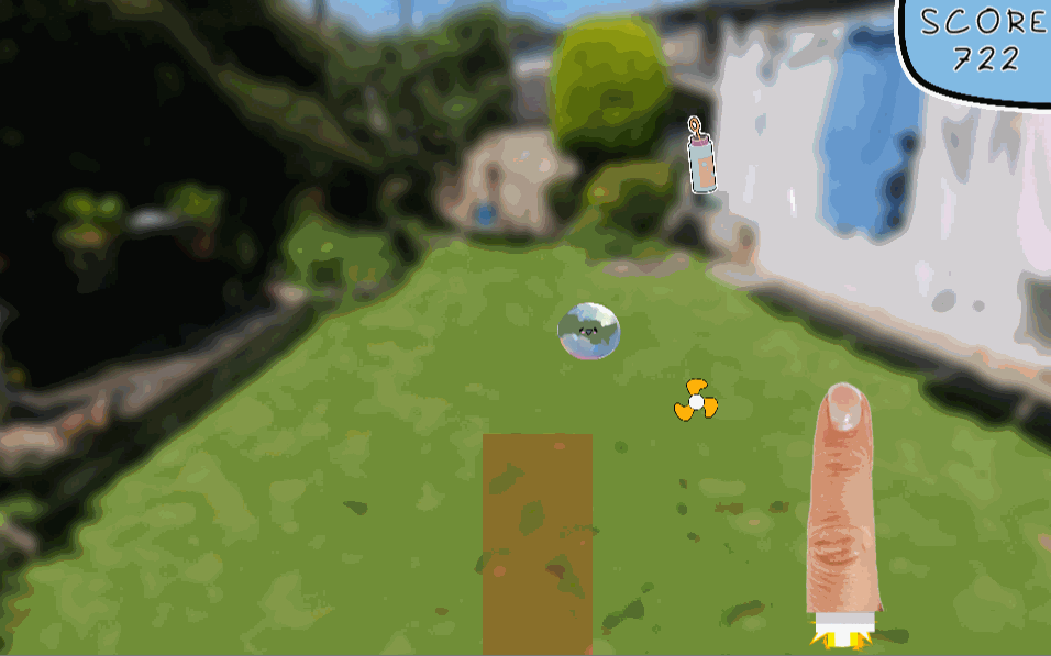
Bubble blowing movement using your mouse
I focused the game on the unorthodox movement of left mouse click to push a bubble around the screen. I used animation and sound effects to sell the idea you're blowing this bubble through the air. Both the bubble and the fan have animations to better communicate the movement.
Their is a learning curve to the movement which allows for player mastery to be a motivator for players to keep playing.
I was inspired by the bubble blowing level "Bubble Breeze Galaxy" from Super Mario Galaxy.
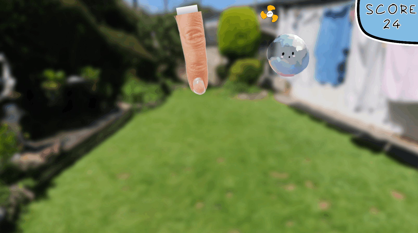
Surprising and charming enemy attacks
In order to communicate a fun and light hearted experience, many of the patterns are comedic, or surprising. I didn't want players to get bored of the fingers simply poking at the screen.
I added a flashy beam attack to keep players on their toes. Players will be excited by these bombastic attacks and will want to keep playing to see if there are any more.
Surprising players is important, so I decided the enemy attacks would be my method of doing so. After designing the attacks in Culinary Coalition, I felt I had the experience to pull off these unique attack patterns as a solo developer.
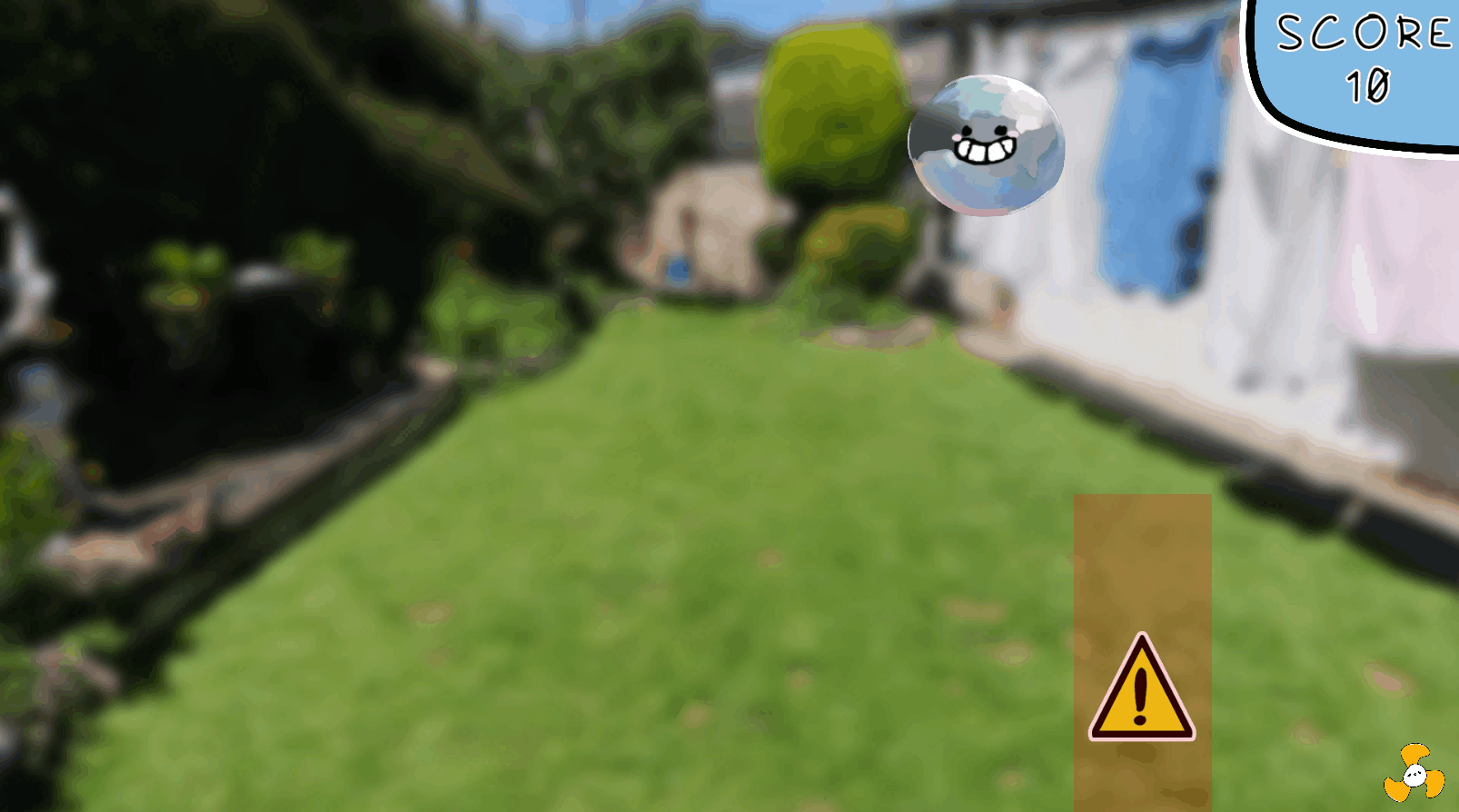
High Score Based difficulty System
The goal of Don't Pop! is to get a high score. Enemy patterns are randomly picked from a pool of moves. When the player reaches a score threshold such as 200 points. The game provides a popup that the difficulty has been increased.
When the difficulty is increased, the pool of enemy patterns is updated with new moves. Players can aim to master each pool of moves and will find new challenges in different score thresholds.
Game Mechanics
Here are some of the other game mechanics present in Don't Pop!. For many of my mechanics I have taken a holistic design approach. One example is the relationship of the shrinking mechanic, which is related to the score system, bubble liquid and player attributes. I want my game mechanics to not only connected by theme and tone, but also by gameplay.
Dash
Through a double click the player can dash across the screen. This is useful to quickly move about the screen to avoid finger patterns.
The trade-off is that the player bounces off the corners of the screen, which can make the dash difficult to use precisely due to it's initial burst speed and unpredictable bounce property.
Players have to consider the risk vs reward of using the dash, as it can benefit the player by placing them into favourable areas faster, however they can't guarantee they will have the skill to manoeuvre precisely to those areas due to the properties of the dash.
Shrinking
After hitting a specific score threshold, instead of new patterns, the player begins to shrink.
The player has a benefit of a smaller hitbox/collider when they are in a small, but they shouldn't risk shrinking too much...
If the player continues to shrink, they will eventually get a game over.

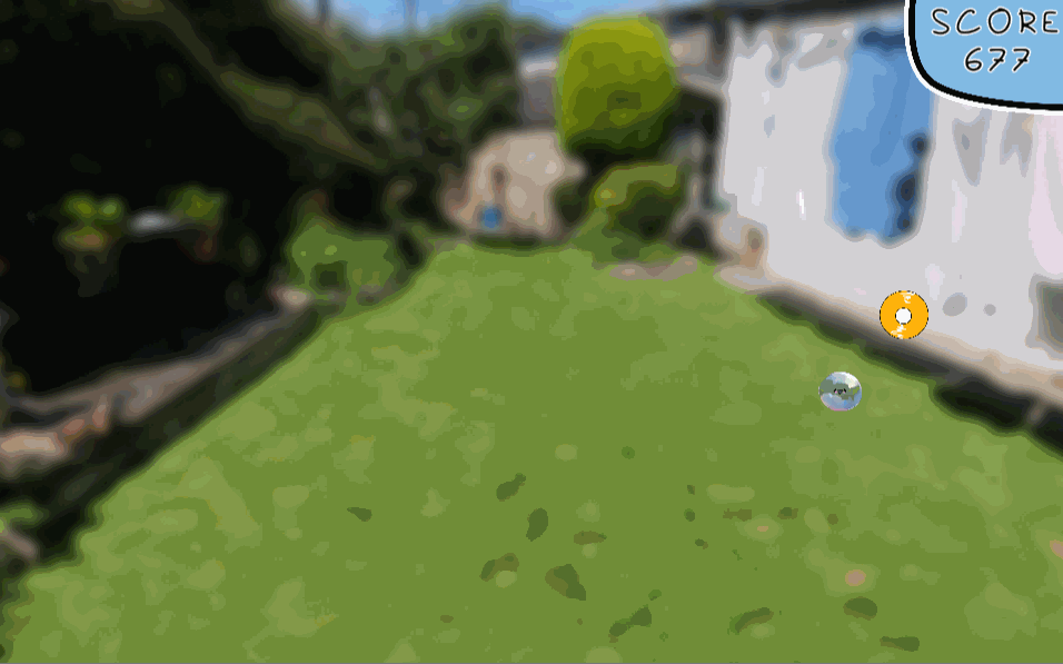
A dangerous spawn of the bubble liquid.
Bubble Liquid
To combat shrinking, players need to pick up randomly spawning bubble liquid pickups.
Bubble liquid increases your bubble's size, and prevents shrinking for x amount of seconds. The bubble can actually grow larger than the original size, which discourages players from mindlessly picking up the liquid, as being large is a disadvantage in a game about dodging.
Players have to balance the benefits of shrinking, with the dangers of shrinking too much. Liquid disappears if not picked up, so players need to account for that when risking staying small.
Not all bubble liquid should be picked up, as the random spawns can cause the liquid to be in dangerous positions. Should players risk grabbing the pickup before it disappears? It will make them larger, but put them in a bad position. Do they need to grow at the moment? Are they actually larger than the original bubble size?
The bubble liquid adds a lot of depth when it gets introduced.
Main Menu
I created a simple main menu for the game, this menu features a cute floating bubble to establish the tone immediately.
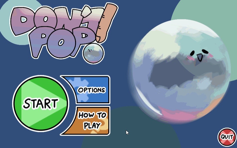
The main menu has a playful transition when you click start.
There is a how to play section in the game where players can read the simple rules and controls.

The options menu only changes audio, the slider has a cute bubble on the end to add to the cute bubble theme.
Documentation Examples
The full GDD for Don't Pop! as this was a solo developed project, I held back on some of the detail so I could prototype earlier. All game mechanics are documented however.
Reflection
At the time I was developing Don't Pop! I had yet to finish a project. I was adamant to finish my first project as I was in the classic cycle of starting new projects and dropping them weeks later. Using the scope practice from Culinary Coalition I was able to create a game concept I felt I could develop 90% solo.
The biggest takeaway from this project was the programming experience I gained. This project was my lightbulb moment for programming as suddenly everything began to click, this was an empowering moment which excited me as it increased the possibilities of prototypes I can create in the future.
Don't Pop! is a cute little game that was the perfect opportunity to finally finish a project, I'm happy I did It!
What went well
-
Aesthetically the game is cohesive and supports the flash game feel I desired to achieve. The contrast of the fingers and environment to the player is jarring, and gives the game an absurd feel.
-
Player control is unorthodox, and has a good learning curve, the dash supports a deeper level of gameplay for players to reach.
-
Scope management was well suited for the team size, I learnt a lot of programming on this project and produced a finished product at the end of it!
What could be improved
-
Player control could be better taught to the player instead of being tucked away in images on the main menu, those images in question should communicate the rules of general movement in a clearer way. The dash input could have been right click instead of a double tap, this would prevent accidental dashes. It was initially a double tap to allow for easy mobile porting.
-
I feel I didn't fully deliver on the craziness of the bullet patterns. I could of created more animations and attacks. Even though I'm proud of the animations and art I created, producing more would allow me to further achieve my key design goal of charm through finger attacks.
-
Difficulty increase could have been communicated with a different method than text that fills the screen, perhaps a screen tint with a sinister cue. The banner is a bit distracting and not as thematic as it could have been.